journeyHR branding: stationery & Website

Rebranding
The new identity for this management consultancy centred on the founders’ skills as innovative problem-solvers specialising in the analysis and streamlining of structures, systems, processes and organisations for the creative industries.
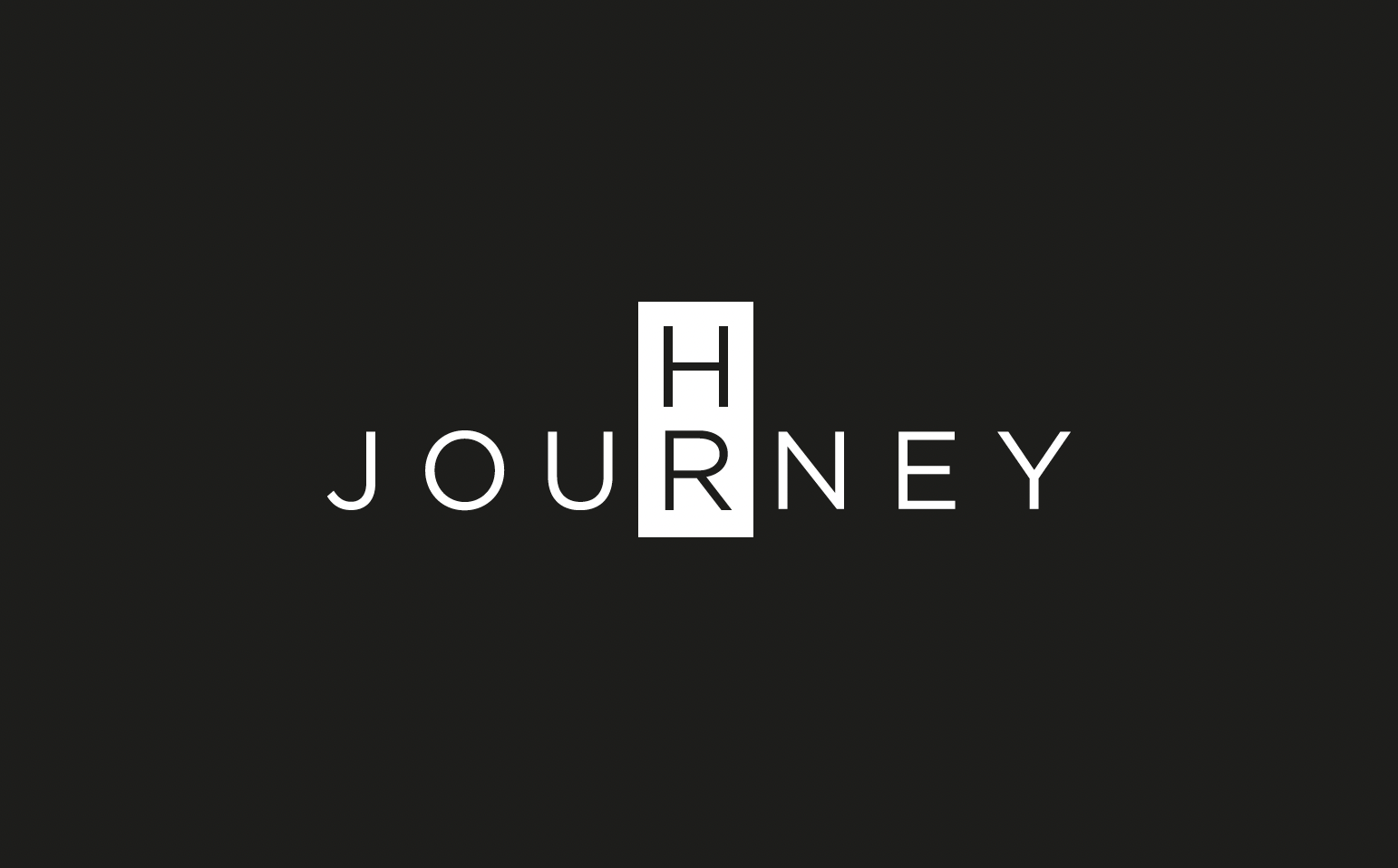
The visual solution was to lay out the logo as a word-search or crossword puzzle, referencing the client’s lateral approach. The block around ‘HR’ also acts a keystone (the crucial central supporting stone in a physical structure) which highlights the fundamental importance of HR in any business or organisation.

Stationery
The business cards were printed on 600gsm Mohawk Superfine with black seams, and the logo was blind embossed and debossed on black Moleskine journal.
Text was centred to echo the centred alignment logo.


Website
The new website developed the branding by adding a secondary colour, and using more playful imagery to bring some of the founder’s personality into the foreground and balance out the calm and professional tone of the logo.