The Canmaker branding: stationery, Marketing, Events & Magazine


The Visual Identity
The Canmaker is the leading trade publication for the metal packaging industry, delivering new features, reviews and comment.
Established in 1988, the visual identity had barely changed since its inception, and needed a complete overhaul to reach a new audience.
I created a new identity comprising the main logo and five sub-logos, stationery, marketing materials and events and social media assets. I also redesigned the magazine itself and created templates for subsequent issues.
The new Canmaker logo replaced the traditional serif font with Trade Gothic, a typeface commonly used in newspapers and chosen to reference the magazine’s long news-making heritage.
I added a bold, graphic icon for a clean, contemporary look. The red circle represents a can as seen from above. The horizontal lines within represent newsprint, a simple visual shorthand for canmaking news. The lines also resemble the corrugated effect of a can viewed side-on, thus illustrating The Canmaker’s ability to communicate canmaking news from different angles.
Finally, a strapline was added to celebrate the magazine’s history and authority.
Full brand guidelines were also provided, offering detailed guidance on the usage of the new assets.


The Canmaker Family
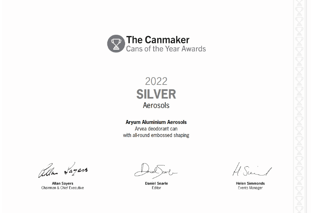
Five sub-brands live under The Canmaker umbrella: The Canmaker Summit, an annual conference; The Canmaker Cans of the Year Awards, an annual ceremony held at the summit and celebrating achievement in the industry; The Canmaker Gold Club, a paid membership; The Canmaker Technical Conference, held annually, and Cannex Fillex, a dual event which is held in two separate world regions.
I devised a range of icons to represent each, with a simple colour palette. Red dominates the palette because of its historical association with the brand and the importance of red in Chinese culture, where The Canmaker has a large and significant readership.


Brand Guidelines
I created comprehensive brand guidelines covering the usage of the logos, exclusion zones, colour palette, fonts & typography and stationery, as well as specific Events & Marketing guidelines.


Marketing
The new branding was applied across all marketing materials, including adverts, emails, banners, media pack, subscription cards & flyers.
Taking inspiration from the magazine masthead, there are subtle differences in logo placement depending on the sub-brand. Circular designs, monochrome images, bold colour palettes and careful use of white space makes the content more legible and eye-catching than before.


Events
The Canmaker runs several large events of its own and has exhibition stands at other events throughout the year, requiring a consistent brand presence.
I created the brand guidelines for all the brand’s event needs, from large-scale conference stands, banners, lecterns and stage backdrops to video and PowerPoint templates, ceremony certificates, delegate programmes, and the smaller-scale merchandise such as lanyards and pens.


Delegate Programme


Magazine
For the magazine, we dispensed with the can icon, to differentiate it from overarchingThe Canmaker brand.
The cover design was somewhat restricted by the need to retain vital advertising space, but I adjusted the proportions of the masthead, using the same typeface as the new logo but reducing the size of the text, and using more space to actually increase legibility. The resulting design was cleaner and more contemporary, and with the addition of the red footer, provided a frame for the adverts to sit within. The red areas were matte laminated, with spot UV highlighting the white and black text areas. The advertising area was also highlighted with spot UV, to differentiate between editorial and advertising.


The Original Branding
The old branding, with its collection of disparate logos and dated fonts and colours, lacked a cohesive identity of its own, and was not representative of The Canmaker’s position as a world-leading voice in the industry.
The new branding created consistency and cohesion across all six Canmaker brands and has been successful in attracting a new audience and new subscribers, as well as garnering compliments from existing clients and customers.